
Dashboard & charts
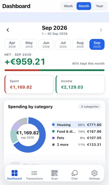
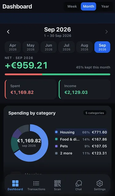
The Dashboard tab shows where your money goes for one week, month or year at a time.
Choose the period
Section titled “Choose the period”- Pick Week, Month or Year at the top.
- Use the arrows, or tap a month in the strip, to move to another period. The current period is marked · to date while it is still running.
What you see
Section titled “What you see”- Net: income minus spending for the period, with how much of your income you kept (for example 45% kept this month).
- Spent and Income: the two totals.
- Spending by category: a doughnut chart of your biggest categories. Tap See all for the full list.
- Income vs spending: both over time, by day, week or month depending on the period.
- Top labels and Top merchants: where most of the money went.
Deposits on bottles and cans are not counted as spending (why).
Open the transactions behind a number
Section titled “Open the transactions behind a number”Almost everything on the dashboard is a shortcut. Tap Spent, Income, a category, a bar in the chart, a label or a merchant, and the Transactions list opens already filtered to match. Go back to return to the dashboard.
No activity yet
Section titled “No activity yet”A new account shows No activity yet. Add a transaction or scan a receipt and the charts fill in.